Summary
Event landing pages are essential for promoting events, whether physical or virtual and converting visitors into attendees. These pages highlight event details, offer persuasive content, and include compelling CTAs. This blog explores 14 best event landing page examples, the key elements to include in an event landing page, best practices, and design tips to help you craft a high-converting event page.
Table of Content
- Introduction
- What is an Event Landing Page?
- What Should Be Included on an Event Landing Page?
- 14 Best Event Landing Page Examples That Inspire
- Essential Elements for a High-Converting Event Landing Page
- Event Landing Page Conversions: Best Practices
- Design Tips for Event Landing Pages
- Conclusion
- FAQs
Introduction
In today’s digital world, creating a dedicated landing page for events has become a cornerstone of effective event marketing. Whether you’re hosting a webinar, conference, or virtual networking event, a focused event landing page simplifies communication, engages the audience, and drives registrations. This guide dives deep into the anatomy of event landing pages, showcasing practical event landing page examples and actionable tips for creating the best landing pages for events that resonate with your audience and maximize conversions.
What is an Event Landing Page?
An event landing page is a specialized webpage designed to promote an event and encourage visitor registrations. Unlike generic pages, event landing pages focus exclusively on one goal: converting visitors into attendees. With strategic web design, event landing pages highlight key details such as the date, time, location, and benefits of attending. For online gatherings, virtual event landing page examples demonstrate how to incorporate links to access the event or join live sessions. Whether showcasing speakers or offering early-bird discounts, an event registration landing page aligns with your audience’s interests to drive action.
What Should Be Included on an Event Landing Page?
An event landing page is a gateway to attracting attendees and providing essential information about the event. It should establish trust, create excitement, and encourage visitors to take action. The design must be user-friendly, with seamless navigation that highlights the event’s unique aspects. The page should answer potential questions while offering a smooth registration process to ensure maximum conversions.
Key Elements to Include in an Event Landing Page include:
- Event Highlights and Unique Selling Points: List the standout features of the event, such as keynote speakers, workshops, networking opportunities, or exclusive content attendees will receive.
- Live Countdown Timer: Incorporate a dynamic countdown that updates in real-time to create a sense of urgency and encourage visitors to register or purchase tickets early.
- Testimonials or Reviews from Past Events: Display quotes, videos, or written testimonials from previous attendees, along with names and roles, to build credibility and trust.
- Social Media Integration and Shareable Links: Add direct links to social media platforms, event hashtags, and buttons for users to share the event with their networks, increasing reach and engagement.
- Comprehensive Contact Information: Provide multiple contact options, such as email addresses, phone numbers, or chat widgets, to assist visitors with inquiries or issues.
- Accessibility Details: Highlight special accommodations for differently-abled individuals, such as wheelchair access, sign language interpreters, or virtual accessibility features.
- Mobile-Friendly and Responsive Design: Ensure the landing page is optimized for all devices, offering a seamless user experience on desktops, tablets, and smartphones.
- Event Logistics Information: Provide specifics about parking, nearby accommodations, transportation options, or virtual login details to help attendees plan their visit.
- Post-Registration Engagement: Include a confirmation message or email prompt for registrants and options to add the event to their calendar or download a digital ticket.
Unleash the Power of High-Converting Event Landing Pages
Turn visitors into attendees with awesome & inspiring page designs.
14 Best Event Landing Page Examples That Inspire
Discover awesome webinar landing page examples that combine exceptional design with powerful messaging to drive conversions. Explore how top brands captivate their audience with strategic layouts, compelling visuals, and clear calls to action. Get inspired to create a high-performing landing page for your business.
1. Web Summit
Web Summit’s event landing page is a masterclass in bold visuals, clear messaging, and strategically placed CTAs. The page highlights keynote speakers, features an agenda, and uses FOMO-driven elements like a countdown timer to boost registrations.
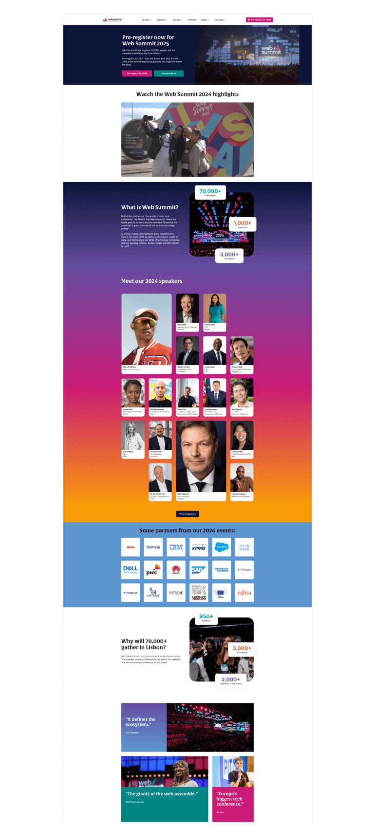
Image SRC: websummit
2. INBOUND by HubSpot
HubSpot’s INBOUND landing page uses concise messaging, video content, and a clean layout to promote its event. The registration process is streamlined, and the CTA stands out, driving conversions effectively.

Image SRC: inbound
3. Google I/O
Google I/O’s landing page exemplifies simplicity and focus. It highlights session details, speaker profiles, and a vibrant design that appeals to tech-savvy audiences, making it one of the best landing pages for events in the tech industry.
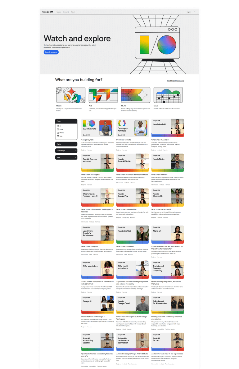
Image SRC: Google I/O
4. Salesforce Dreamforce
Salesforce’s Dreamforce event page prioritizes customer-centric messaging and clear navigation. With engaging visuals and concise information, the page effectively promotes the event while ensuring easy access to registration options.
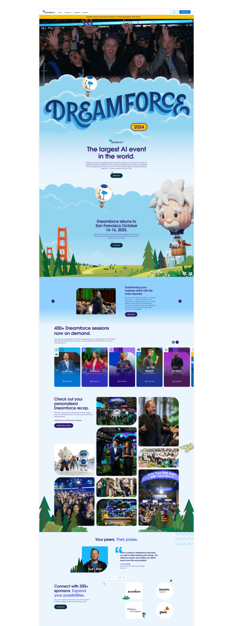
Image SRC: dreamforce
5. Tomorrowland
Tomorrowland’s page is visually stunning, creating an immersive experience for visitors. The landing page leverages dynamic graphics, high-quality images, and a strong brand aesthetic to generate excitement and boost ticket sales.
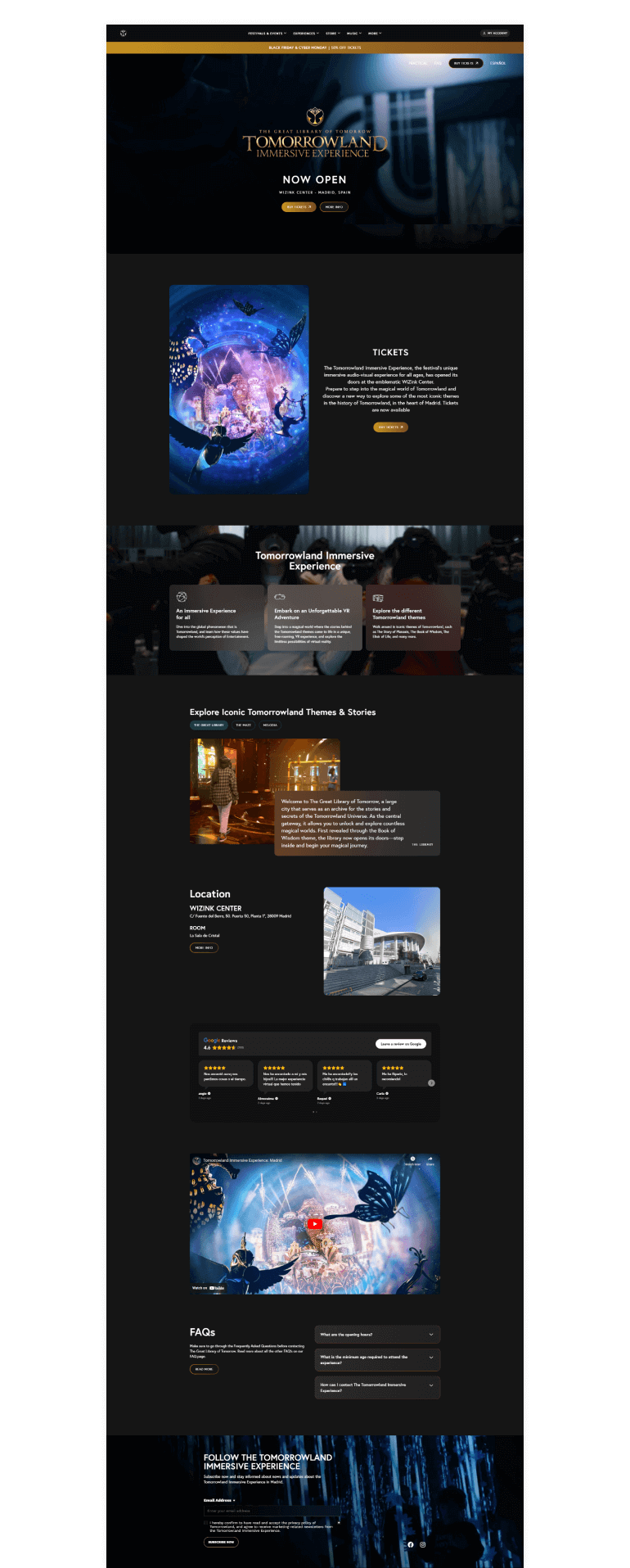
Image SRC: tomorrowland
6. Comic-Con
Comic-Con landing pages use fun, fandom-driven designs, and detailed event schedules to attract a global audience. The page is designed to engage and excite attendees with visuals and key event highlights.
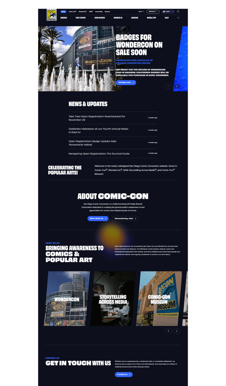
Image SRC: comic-con
Your perfect landing page is just a design away.
Partner with expert designers to create pages that captivate and convert.
7. Adobe MAX
Adobe MAX’s landing page showcases creativity through interactive design and engaging visuals. The page provides clear registration options, speaker highlights, and a user-friendly layout, ensuring seamless navigation.
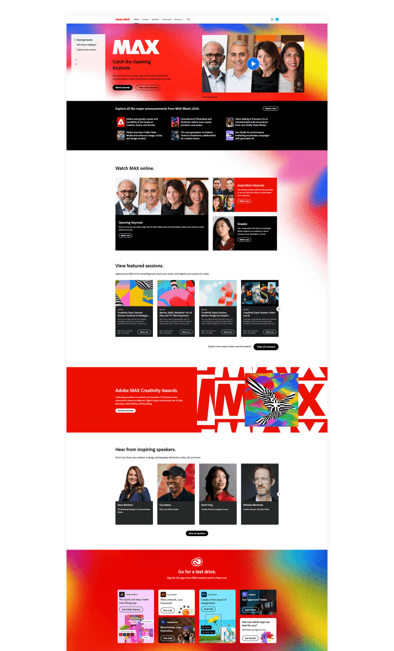
Image SRC: max
8. Startup Grind Global Conference
Startup Grind’s landing page emphasizes the value of networking and entrepreneurship. By showcasing testimonials, speaker profiles, and an engaging agenda, it appeals to professionals and startups alike.

Image SRC: startupgrind
9. SXSW
South by Southwest uses bold typography, interactive elements, and FOMO-driven content to capture the visitor’s interest. By showcasing an extensive lineup of activities, this website events page example inspires potential attendees to register.
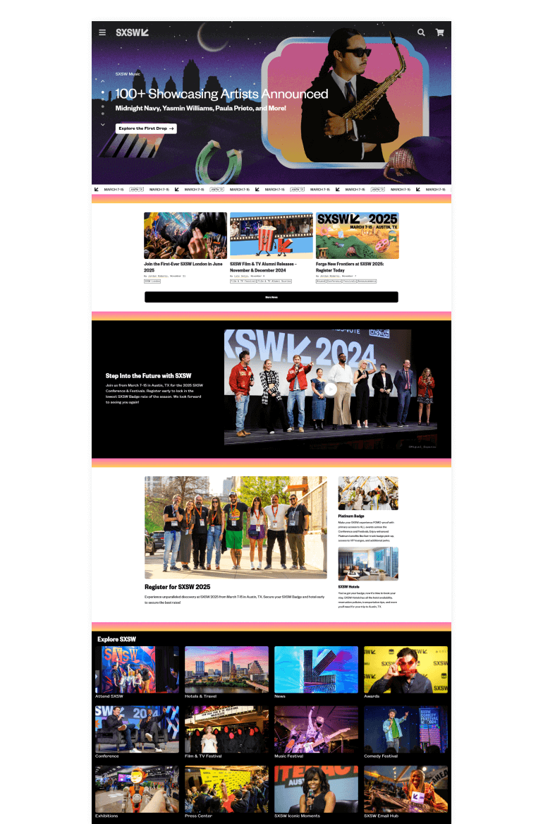
Image SRC: sxsw
10. Apple Product Launch Events
Apple’s event pages are sleek and modern, with minimalistic designs that focus on high-quality visuals and core event details. The CTAs are strategically placed, ensuring smooth registration.
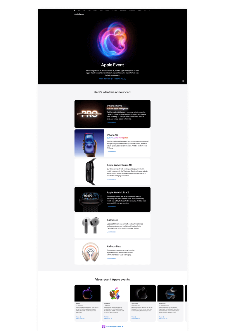
Image SRC: apple-events
11. Fitness+ Events by Apple
Apple Fitness+ promotes health-focused events with clean, vibrant designs. Their landing pages use high-quality images and a consistent theme to inspire audiences to join their fitness sessions.

Image SRC: apple-fitness-plus
12. Social Media Week
Social Media Week’s page uses engaging visuals and bold text to appeal to its digitally savvy audience. By highlighting networking opportunities and speaker insights, it effectively draws in professionals from the industry.
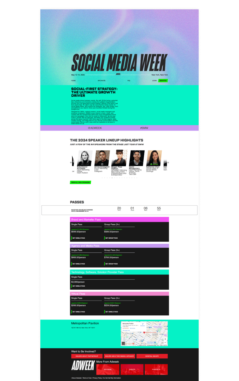
Image SRC: SMW_2025
13. Tony Robbins’ Events
Tony Robbins uses urgency-driven strategies, such as countdown timers and limited-time offers, on his event landing pages. These tactics encourage visitors to act quickly and secure their spots.
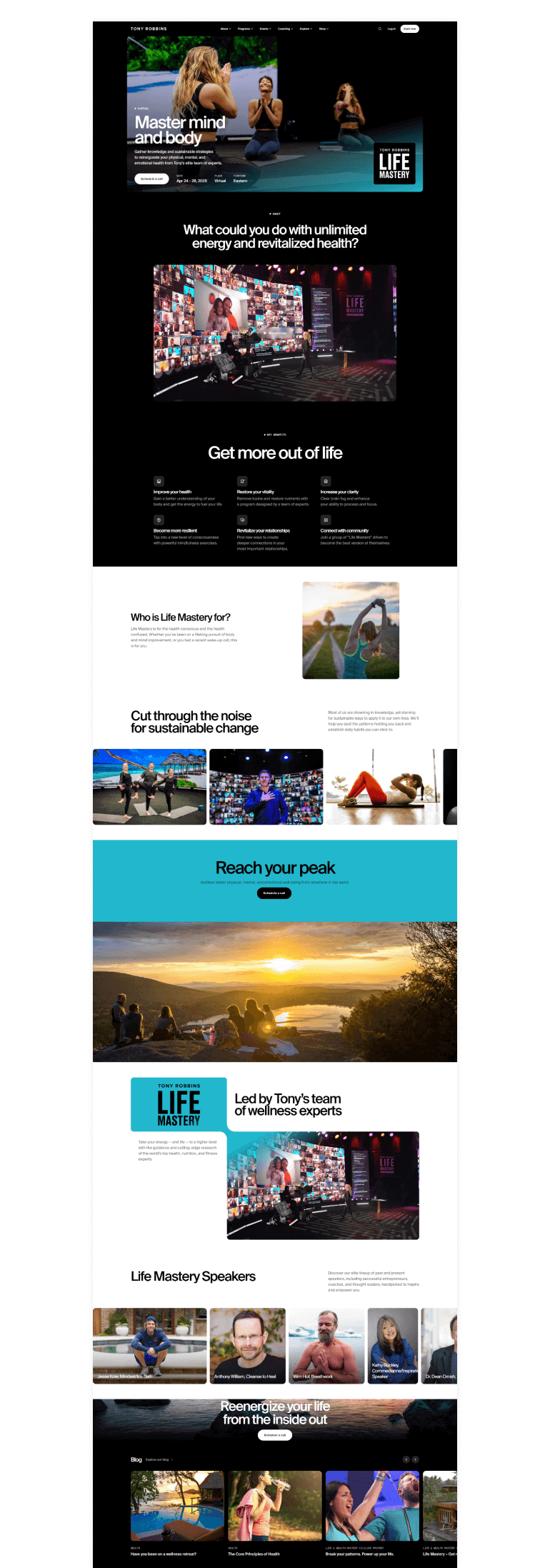
Image SRC: life-mastery
14. Forbes Women’s Summit
Forbes Women’s Summit uses elegant designs and inspiring content to connect with its niche audience. This webinar landing page example highlights notable speakers and testimonials, building credibility and interest.

Image SRC: 2025-forbes-3050-summit-abu-dhabi
Essential Elements for a High-Converting Event Landing Page
Creating a compelling event landing page is crucial to attracting visitors and driving conversions. Whether your goal is to sell tickets, encourage registrations, or generate leads, a well-designed landing page can make all the difference. To ensure your page is effective, it must include these essential elements:
Captivating Event Name and Title
A strong and engaging event name should be the highlight of your landing page, immediately drawing the visitor’s attention. Adding a tagline or subheading provides further context and piques curiosity about the event’s purpose or theme.
- Choose a title that reflects the event’s focus.
- Add a short tagline to elaborate on the event’s value.
- Use large, bold text at the top of the page to ensure visibility.
Essential Date, Time, and Location
Making the event’s logistics easy to find ensures visitors quickly grasp when and where it’s happening. For virtual events, providing access details is equally crucial.
- Display the date and time prominently near the top of the page.
- Include the venue address with a link to Google Maps for in-person events.
- Provide webinar or virtual event platform details for online events.
Eye-Catching Hero Image or Banner
A compelling visual can set the tone for your event and capture visitors’ interest immediately.
- Use high-quality images that align with your event’s theme.
- Incorporate the event logo to build brand recognition.
- Place the image as the backdrop or centerpiece of your landing page.
Clear Call-to-Action (CTA)
Your CTA should guide visitors to the next step, whether it’s registration, ticket purchase, or RSVPing.
- Use action-oriented text like “Register Now” or “Get Tickets.”
- Ensure the CTA button is prominently placed and stands out visually.
- Link the button directly to the registration or payment form.
Brief Event Overview
Visitors want a concise explanation of what the event is about and why they should attend. An engaging overview helps communicate its value.
- Summarize the event’s purpose in a few sentences.
- Highlight key benefits or takeaways for attendees.
- Use bullet points for clarity if multiple points need emphasis.
Speaker or Performer Highlights
If your event features notable figures, showcasing them can significantly boost interest and credibility.
- Add photos and bios of keynote speakers or performers.
- Include links to their professional profiles or social media.
- Highlight their achievements or relevance to the event’s theme.
Detailed Agenda or Schedule
A clear event agenda helps attendees plan their time and generates excitement for specific sessions.
- Use a timeline or table format to organize the schedule.
- Mention key sessions, activities, and networking opportunities.
- Include start and end times for each segment of the event.
Pricing and Ticket Options
Transparent pricing information ensures visitors understand what they’re getting and encourages conversions.
- List ticket prices and benefits for each tier (e.g., VIP, Early Bird).
- Highlight any discounts or limited-time offers.
- Clarify refund or cancellation policies.
Countdown Timer for Urgency
Adding a countdown timer can create a sense of urgency and encourage visitors to act quickly.
- Place the timer near the registration or CTA section.
- Use a clear format that shows days, hours, minutes, and seconds.
- Adjust the timer dynamically to end at the registration deadline.
Contact Information and FAQs
Providing easy access to contact details ensures visitors can resolve their queries without hassle.
- Include an email address, phone number, or live chat option.
- Add a FAQ section to address common questions.
- Offer links to support or help documentation if applicable.
Event Landing Page Conversions: Best Practices
Creating an effective event landing page requires a strategic approach to ensure high conversions. A compelling headline, engaging visuals, and a clear call-to-action (CTA) play a pivotal role in capturing attention. Incorporating concise yet persuasive copy that highlights the event’s unique value proposition encourages visitors to take action. Social proof, such as testimonials or past event success metrics, builds trust and credibility. Optimizing the page for mobile devices and ensuring fast loading times enhance the user experience. Additionally, integrating analytics tools allows tracking and improving conversion rates effectively. At Glorywebs, we turn your inspiration into action! Let us design your landing page and get ready to boost engagements.
Key Best Practices for Event Landing Page Conversions:
- Compelling Headline: Use a headline that immediately grabs attention and clearly states the event’s purpose or value.
- Engaging Visuals: Include high-quality images or videos relevant to the event to create an emotional connection and generate interest.
- Clear Call-to-Action (CTA): Ensure the CTA is prominently displayed, action-oriented, and encourages immediate engagement, such as “Register Now” or “Save Your Seat.”
- Persuasive Copy: Write concise and impactful content that highlights the unique benefits and features of attending the event.
- Social Proof: Add testimonials, attendee reviews, or success stories from past events to establish credibility and build trust.
- Mobile Optimization: Design the landing page to be mobile-friendly, ensuring seamless accessibility for users on all devices.
- Fast Loading Speed: Optimize the page’s loading time to reduce bounce rates and improve user satisfaction.
- Analytics Integration: Use tools like Google Analytics to monitor visitor behavior and measure the effectiveness of the landing page, making data-driven improvements as needed.
Design Tips for Event Landing Pages
An impactful design can make or break your event landing page. Start by creating a strong visual hierarchy using headings, subheadings, and bullet points. Incorporate colors that evoke emotions aligned with your event theme. Use high-quality visuals, such as images or videos, to make the page engaging. Ensure your CTA buttons stand out with contrasting colors and bold text. Typography should be bold yet readable, guiding the visitor’s eye toward essential details. Strategic use of whitespace prevents clutter and enhances readability. Most importantly, ensure the page is responsive, adjusting seamlessly across devices. For inspiration, analyze virtual event landing page examples to see how top brands design for engagement and usability.
Conclusion
Event landing pages are powerful tools for converting visitors into attendees, making them an indispensable part of event marketing. Whether you’re promoting a webinar, conference, or in-person event, a well-designed page with compelling visuals, clear CTAs, and persuasive content can significantly boost registrations. By following best practices, drawing inspiration from event landing templates, and using landing page optimization tools, you can create a page that not only looks great but also delivers results. Don’t underestimate the importance of analytics and optimization to continually improve your page’s performance. When done right, your event landing page can set the tone for an unforgettable event experience.
FAQs
An event landing page is a dedicated webpage designed to promote and drive registrations for an event by providing essential details, showcasing its value, and encouraging action through CTAs.
Website events page examples include Web Summit, Google I/O, and Adobe MAX, which use clear messaging, engaging visuals, and streamlined navigation to drive conversions.
Webinar landing page examples like Zoom and Google Meet landing pages focus on online registration, event access, and detailed schedules to engage virtual audiences.
Key elements include the vent name, date, time, location, a compelling CTA, a simple registration form, visuals, testimonials, and an FAQ section.
Focus on clarity, mobile optimization, urgency-driven content, and testimonials. Use persuasive copy and clear CTAs to guide visitors toward registering.

Comments